
a few words...
The Anatomy of an Embrace
The Conceptual Form: The Maternal Vessel
The logo is a continuous line art mark where the silhouette of a mother’s form—arms curved in a hug and a soft, rounded lap—doubles as the silhouette of a classic pottery vessel. This visual double-entendre communicates that your products aren't just clay; they are "vessels of care".
Geometric Soul: The Circle of Connection
The logo utilizes round composition. It represents protection. By enclosing the motherly figure within a soft, hand-drawn logo, we visually represent the safety and warmth of a childhood kitchen. The "lap" becomes the stable base of the pottery item, symbolizing the foundation of family and tradition.
Minimalist Line Weight
The design uses variable-width strokes to mimic the appearance of a potter’s tool carving into wet clay. This "human-drawn" quality ensures the logo feels artisanal rather than corporate.
Palette: Earth & Skin Tones
Primary Mark: Rendered in Deep Umber or Terracotta.
Secondary Application: On digital platforms, the mark can appear in Mocha Mousse (2025 Color of the Year), providing a soft, skin-like warmth that reinforces the "hugging" concept.
Texture as a Design Tool
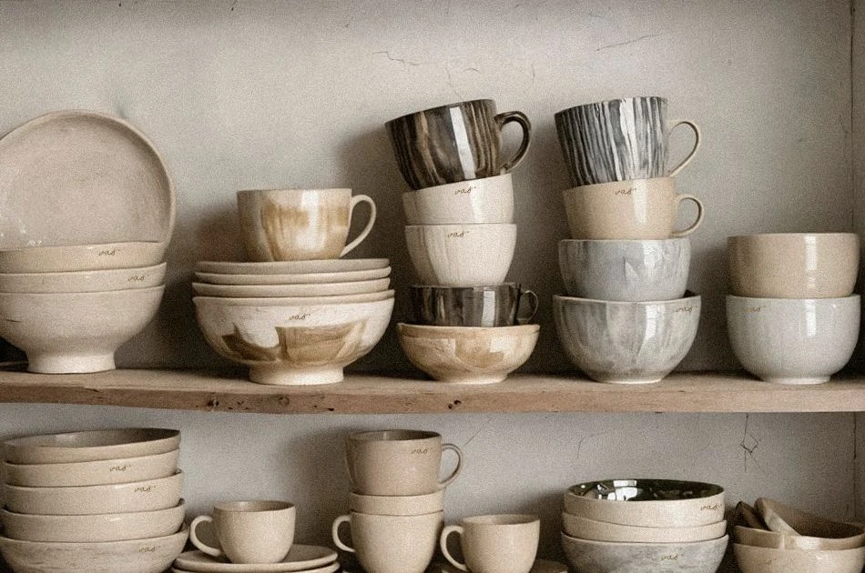
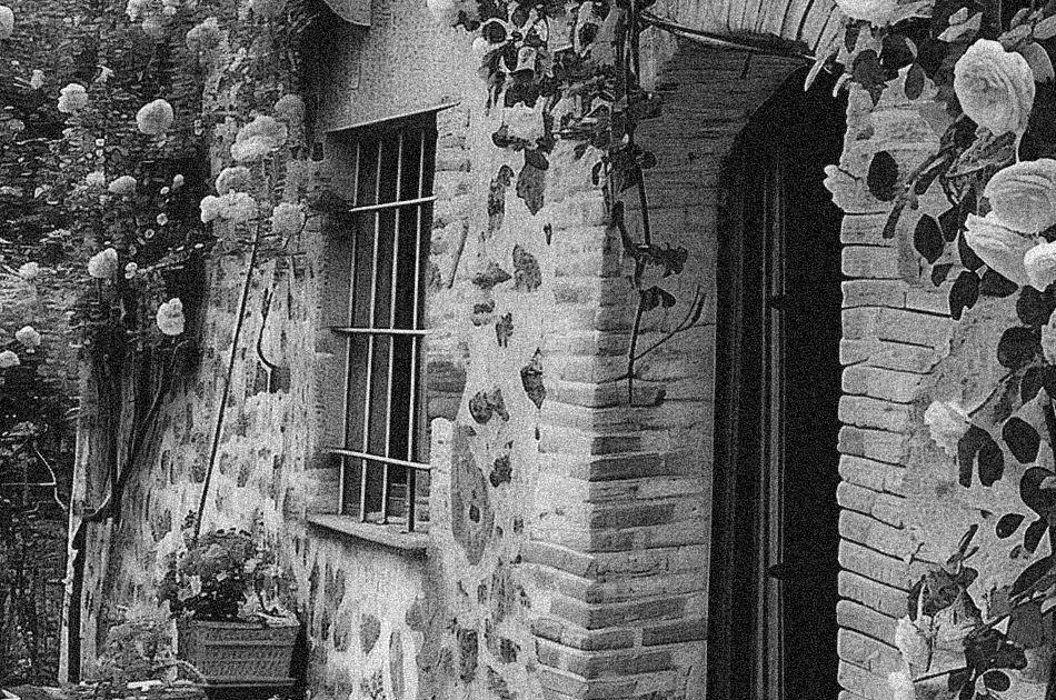
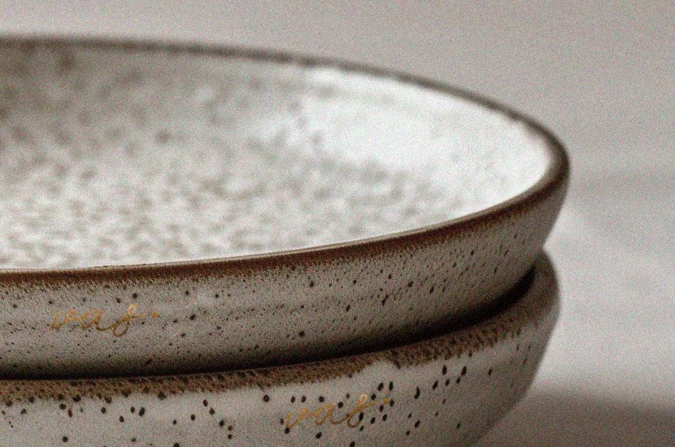
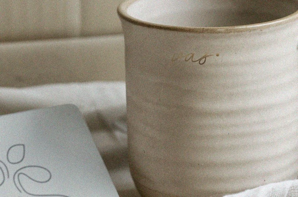
vas. utilizes textured grains and layered visuals in its digital and print assets. Packaging and web interfaces feature simulated paper textures and botanical impressions, mimicking the tactile experience of raw clay. This "Rewilding" of digital spaces creates a sensory connection that honors the artisanal nature of the pottery.