
a few words...
The Power of the Seed (Bija)
Grown with love, gathered by hand.
Bija is more than a marketplace; it is a living network of nurturers. Brand honors a community of women who have spent years nurturing their families and are now turning that same dedicated care toward the Mother Earth. Bija believe that the most vital food comes from a place of love, patience, and a deep respect for the land.
When I approached the visual identity/story for Bija, I wanted to avoid the "perfect" look. Bija isn't a factory; it’s a kitchen table and a backyard garden. My goal was to create a design system that feels like a handwritten letter from a friend—tactile, honest, and deeply nurturing.
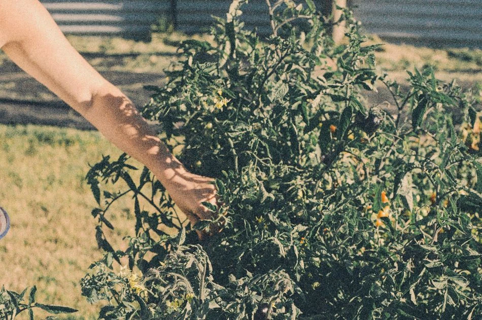
Story is written in the soil of private backyards and kitchen gardens. The inspiration comes from the "quiet giants" of our neighborhoods—middle-aged women who have mastered the art of tending. After years of raising children and building homes, these women have found a second calling in the rhythmic cycle of the seasons. Like the seeds they plant, they are proof that regrowth and vitality are possible at any stage of life.
Every carrot, leaf, and vine sold through Bija has been hand-tended by a woman who knows the history of her soil. They aren't just selling "fresh veggies"; they are sharing the surplus of a life lived in harmony with nature. When you choose Bija, you are supporting a woman-led economy that values community trust and nurture.
The Primary Icon: A stylized seed (Bija).
The Texture: High-grain paper, corrugated cardboard, and linen overlays.
The Layout: Spacious and "slow," encouraging the viewer to linger, much like the slow-growth process of a garden.
The Packaging Vision: Simple glass jars and compostable paper bags with minimalist, hand-stamped labels that prioritize the product over the brand.