
a few words...
EDA: The Visual Ethos of Nurturing Wood
From a graphic designer’s perspective, EDA is a study in Biophilic Design—the practice of creating a visual connection between people and nature. The brand story is a living system where the strength of a forest is translated into a refined, high-end identity.
1. The Core Symbol: The Maternal Canopy
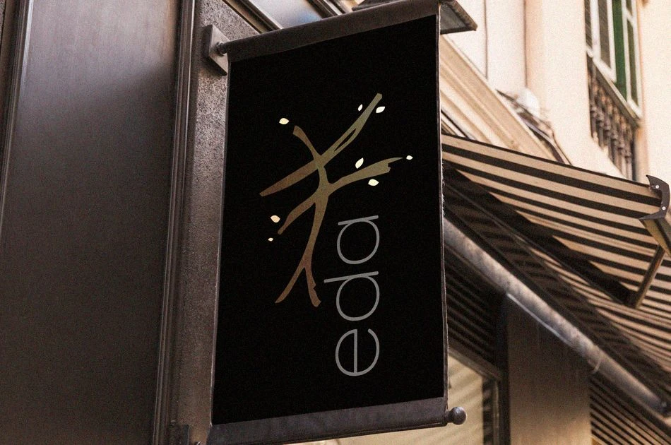
The brand mark is designed as a generative silhouette. It is an abstract fusion of a sprawling tree canopy and the protective curve of a mother's embrace. The branches are rendered with variable line weights, mimicking the natural, non-linear growth of living wood. This logo acts as a "seal of nurture," promising that every piece of furniture is a supportive anchor for the home's life and growth.
2. The Typographic Profile: Soft Authority
Reflects "robust yet graceful" forms.
The Structure: The letters have flared terminals and organic curves, suggesting the fluidity of sap and the gentle bend of branches.
The Tone: It is set with wide tracking (letter-spacing) to evoke a sense of "interior sanctuary" and calm, allowing the brand name to breathe on the page just as the furniture does in a room.
3. The Palette: Lithic & Arboreal
The color strategy moves away from artificial tones toward a Curated Earth Palette:
Deep Bark: A rich, dark brown that serves as the foundation for strength.
Golden Sap: A warm, honey-toned accent used for highlights, reflecting the "life-giving flow" mentioned in the story.
Canopy Mist: A soft, muted grey-green that provides a calm, neutral backdrop, allowing the natural grain of the wood to remain the hero.
4. Visual Texture & Grain
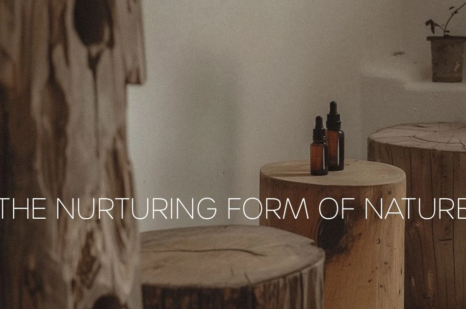
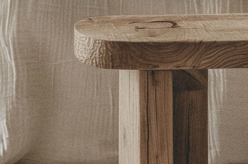
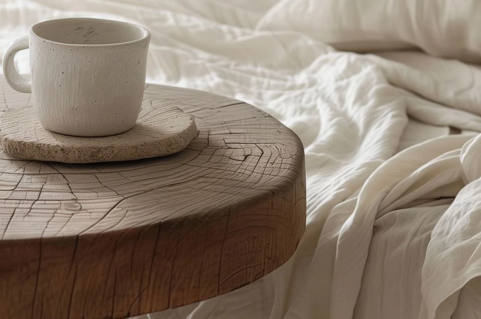
In digital and print collateral, EDA utilizes Macro-Photography as a primary graphic element. We focus on extreme close-ups of wood grain, knots, and "imperfect" rings. By treating these natural textures as "abstract art," we visually reinforce the brand's commitment to honoring the unique, delicate story within every piece of timber.
5. Layout: The Silent Strength
The editorial design for EDA follows the "Rule of Thirds" found in nature, utilizing asymmetrical layouts that feel organic rather than rigid. Just as a forest doesn't grow in straight lines, the brand's visual system embraces a flowing grid, guiding the customer through a journey of warmth and natural beauty.